
Primer Notes
How to tell an original turn of the century poster from a later reprint
Posters from the late 1890s are still affordable at fairs, and so are the reproductions sold beside them. These are the checks that settle which one you are holding, before provenance ever comes up.
A poster printed in the late 1890s and a reproduction printed in 1975 look identical in a photograph. In the room they behave differently, and almost every difference comes from how the sheet was printed and what it was printed on. Stone lithography puts ink into the paper in flat areas of color, while a modern reproduction lays a screen of dots on top of it. A cheap loupe settles most arguments before you ever ask a seller about provenance.
Dealers who trade this material know it, which is why the honest ones hand you a loupe without being asked. The ones who would rather you did not look closely will talk about rarity and about the artist instead. Your job is to bring the conversation back to the object: the paper, the ink, the margins and the printer line along the bottom edge. None of that needs an art history degree, and all of it can be done while you are standing at the stall.
What the printing tells you
Under magnification a period lithograph shows color laid down in continuous areas with slightly ragged edges where one stone met the next. Registration is rarely perfect, so a contour sits a hair away from the color it was drawn to hold. A photomechanical reproduction shows a regular rosette of dots in every colored area, including flat backgrounds that should carry no dots at all. If you see that pattern, the sheet was made after the process existed, and no amount of paper toning changes the answer.
Paper is the second test. Poster stock of that period was cheap wood pulp, thin, and it browns from the inside out, so an original usually tones evenly rather than sitting bright white with a stained border. Many originals were folded for shipping in the printer parcels, and those folds run in a regular grid rather than at random. A sheet with no fold lines is not automatically wrong, but it should make you ask where it spent the last hundred years.
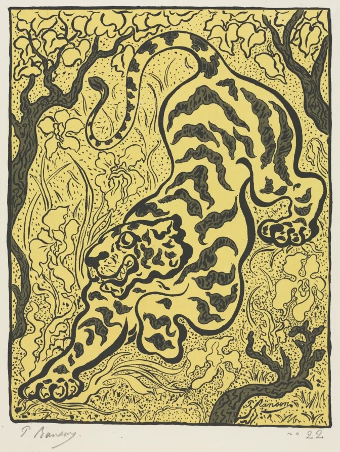
The printer imprint at the lower margin is the detail reprints handle worst. Period sheets usually carry the workshop name in small type along the bottom, and trimming the margin removes it. A poster trimmed to the image is worth less anyway, so a missing imprint costs you twice over. When a seller explains that the margin was cut to fit an old frame, price the sheet as trimmed and decide from there.
- Put a loupe on a flat area of color and decide whether it is solid ink or a screen of dots
- Turn the sheet over and read the paper tone from the back, where later coatings rarely reach
- Find the printer line along the bottom margin and photograph it before you start negotiating
- Measure the sheet and compare it against the standard formats the workshop actually used
- Ask when the linen backing was done and whether losses were filled during that treatment
Linen backing deserves its own conversation. Backing was normal practice for decades and does not by itself hurt value, but it hides paper repairs, replaced corners and retouching along the fold lines. Raking light across the surface shows where filled losses sit slightly lower than the original sheet. Ask for photographs taken before the treatment, and treat their absence as a reason to pay less rather than as a reason to walk out.
Restrikes, series and honest reprints
Later printings are not all fakes. A subscription series of reduced size plates was published in Paris between 1895 and 1900 for collectors, and those sheets are period objects with a market of their own. Museum and publisher editions from the 1960s onward are legitimate too, and many carry a printed line that says exactly what they are. The problem is only the seller who lets you assume that a reprint is the poster itself.
A price that depends on the buyer not owning a loupe is not a price, it is a bet against the buyer.
Write down the size, the printer line and the condition notes before you agree on anything, and photograph the lower margin while you are there. Museum collections are the cheapest way to train the eye, and the print holdings at the Cleveland Museum of Art and the Metropolitan Museum of Art are searchable for free. Twenty minutes with real examples on screen will save you a bad purchase at the next fair.
Frequently asked questions
How can I tell an original lithographic poster from a later reprint?
Look for the printer's name and address in the margin, the paper (originals are on thin, often browned stock), stone lithography with visible grain rather than a dot screen, and the size, which reprints often reduce.
Are reprints worthless?
No, but they are decoration priced accordingly. A period reprint by the same printer can have modest value. A modern offset copy has none beyond its cost as a print.
Does linen backing affect value?
Conservation linen backing is standard for large posters and does not reduce value if done well. Backing that hides tears or overpainting is another matter, so ask for photographs taken before the work was mounted.
Still deciding? Take the next step.
Stuck on this step?
Still unsure what this means for you?
Notes stay general on purpose. Describe your own case — the work, the price, the seller — and we will answer by email.